Corrections Ink
Corrections Ink’s founders wanted a logo that would immediately—and concisely—express their services. They realized fulfilling their requests was a tall order: professional but not cold; approachable but not inappropriately friendly; and flexible enough to accommodate shifting client bases as well as partners/subcontractors occasionally brought on board when workloads increased. Finally, the mark should portray the genuine people shepherding their clients’ projects with integrity.
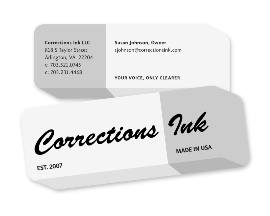
What resulted was a retro-styled mark based upon the familiar shape and color of a dual eraser. Using this as a springboard, we created a die cut business card in the same shape, allowing the logo to take up the entire front of the card while the owners’ particulars were on the back. With this economic use of space, Corrections Ink was able to show their wit…succinctly.


