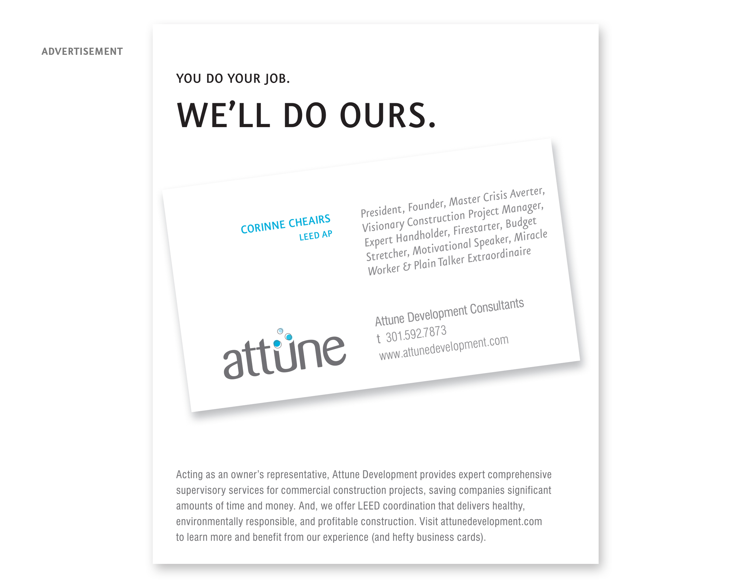
Attune Development Consultants
HISTORY
We were originally contracted to assess the brand of CDT (Comprehensive Development Team) Design Consultants (CDTDC), a construction management company that handles every aspect of commercial development and acts as the business owner’s representative, allowing them to focus on their core responsibilities.
Our initial review revealed that the CDTDC acronym confused their target market, decreased their likelihood of being remembered, and sounded more like a shadowy secret government agency populated by ninjas. We also discovered that their marketing materials weren’t clearly showcasing their services—so much so that potential clients frequently said, “I didn’t know you did that!” during presentations.
TREATMENT I: Naming
We created the name Attune Development Consultants to reflect how the company truly assists its clients by saving them a considerable amount of effort, time and money. The word attune has several very positive definitions, including balance, integrate and coordinate. It infers that Attune’s goal is to achieve the best possible outcome for their clients and that the company is knowledgeable (and attuned) to all facets of the construction industry. We included the word development in the name to reinforce the fact that the company can coordinate everything–from finding the building site to ensuring that their clients are satisfied with their completed space.
TREATMENT II: Logo and Tagline
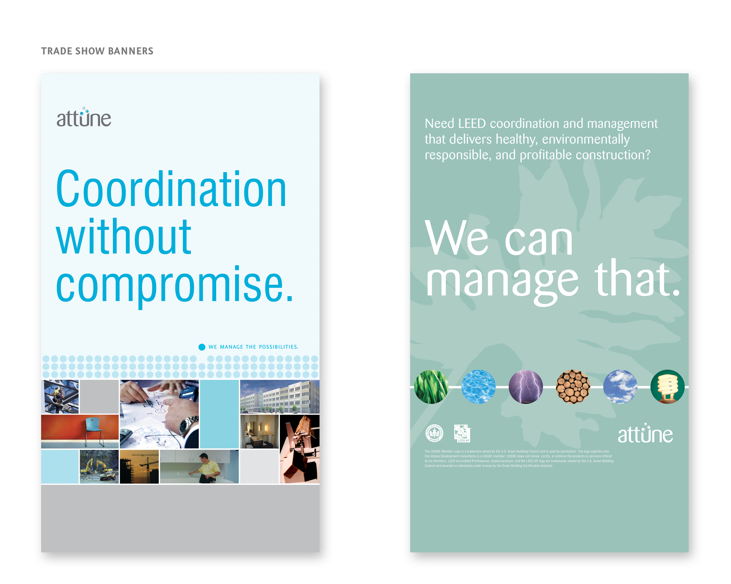
The Attune logo offers a slightly whimsical yet grounded approach to the company’s mission. Three balls convey the idea that the construction process has many facets and that Attune deftly juggles/coordinates them all. The tagline, “We manage the possibilities.”, summarizes Attune’s fresh outlook on every project.
TREATMENT III: Collateral
We took a warm yet professional approach with Attune’s collateral and direct mail. The brochure concept utilizes a daylong timeline to highlight the numerous challenges that must be addressed in order to keep a construction project on schedule and on budget. The photography illustrates key steps in the development process while the colors reinforce the Attune brand color palette. With the headline, “We get dirty so you don’t have to.”, the direct mail piece engages the reader and serves as a teaser encouraging recipients to visit the website or call to receive the informational brochure.
As Attune’s capabilities expanded, we developed a brochure showcasing the environmental and fiscal values of hiring their LEED certified consultants. Reusing the initial brochure’s dotted line along the bottom, we enlarged the dots to include imagery representative of LEED-focused areas. Pairing what could have been overwhelming statistics with approachable content supported the play on Attune’s tagline, “We can manage that.”
Finally, the brand’s visual voice was extended through trade show banners, t-shirts and advertising. Aria was also contracted to take care all of Attune’s print and online copy writing.