Charlie’s Place
BACKGROUND
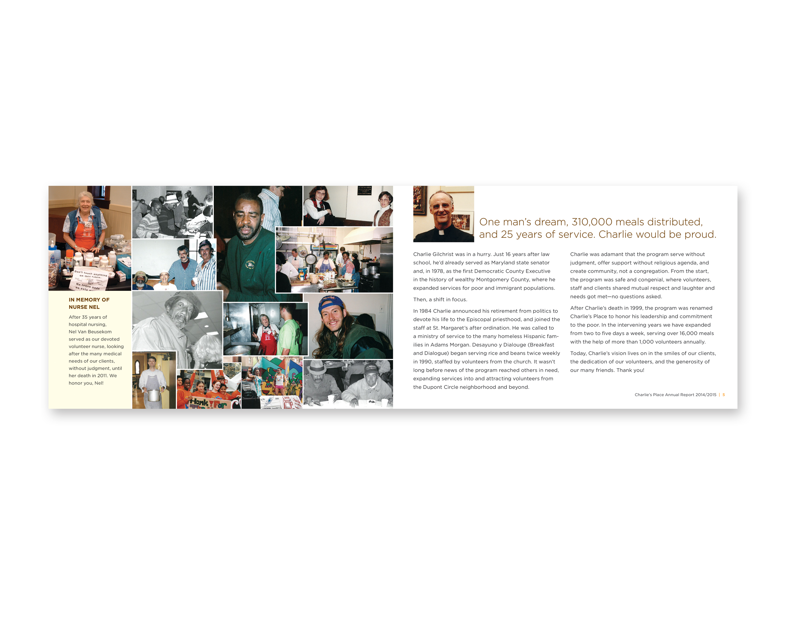
Founded by Rev. Charlie Gilchrist after his retirement as a state senator, Charlie’s Place had a wonderful story to tell: each weekday morning they provide their homeless neighbors fresh meals, case management, healthcare, haircuts, clothing and—most of all—hope. They visit as they are: some clean, some dirty, some sober and some have not. Whether they come stressed by circumstances on the street or by severe mental illness, Charlie’s Place encourages those needing a push and embraces those where no amount of pushing will help. And while all of this is wonderful, the nonprofit’s brand voice was so garbled that its aspirational message was lost.
TREATMENT I: Logo and stationery
I heard repeatedly from clients of Charlie’s Place that what made this nonprofit different is that it wasn’t just a meal handout—people actually cared about them. Coming there every morning gave them a sense of belonging to a (mostly male) community that they wouldn’t otherwise have. When they were absent, people not only worried for their well-being but often called area hospitals looking for them. The meal of course was also good and having coffee with their peers was the highlight of their day. Sharing a cup of coffee can be very equalizing, creating a momentary sense of community. In addition, being touched in a reassuring way is something the homeless rarely get but which also creates intimacy. After exploring several ways to show how Charlie’s Place provided both of these things to its clients, it became clear that the hands holding the coffee cup not only communicated these ideas immediately to those unfamiliar with their programs but also resonated the most with Charlie’s Place as well as their clients and the surrounding Dupont Circle community.
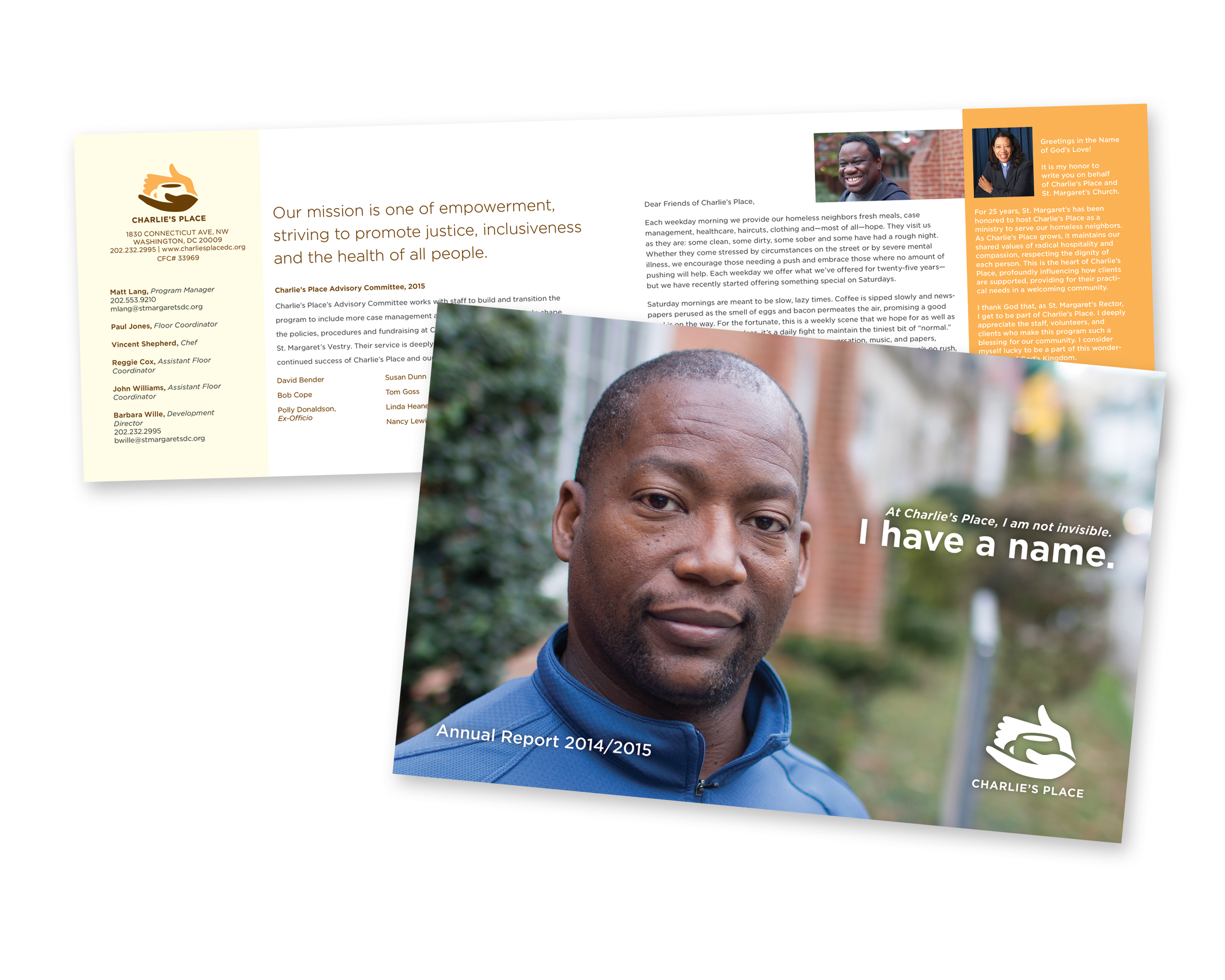
TREATMENT II: Annual Report
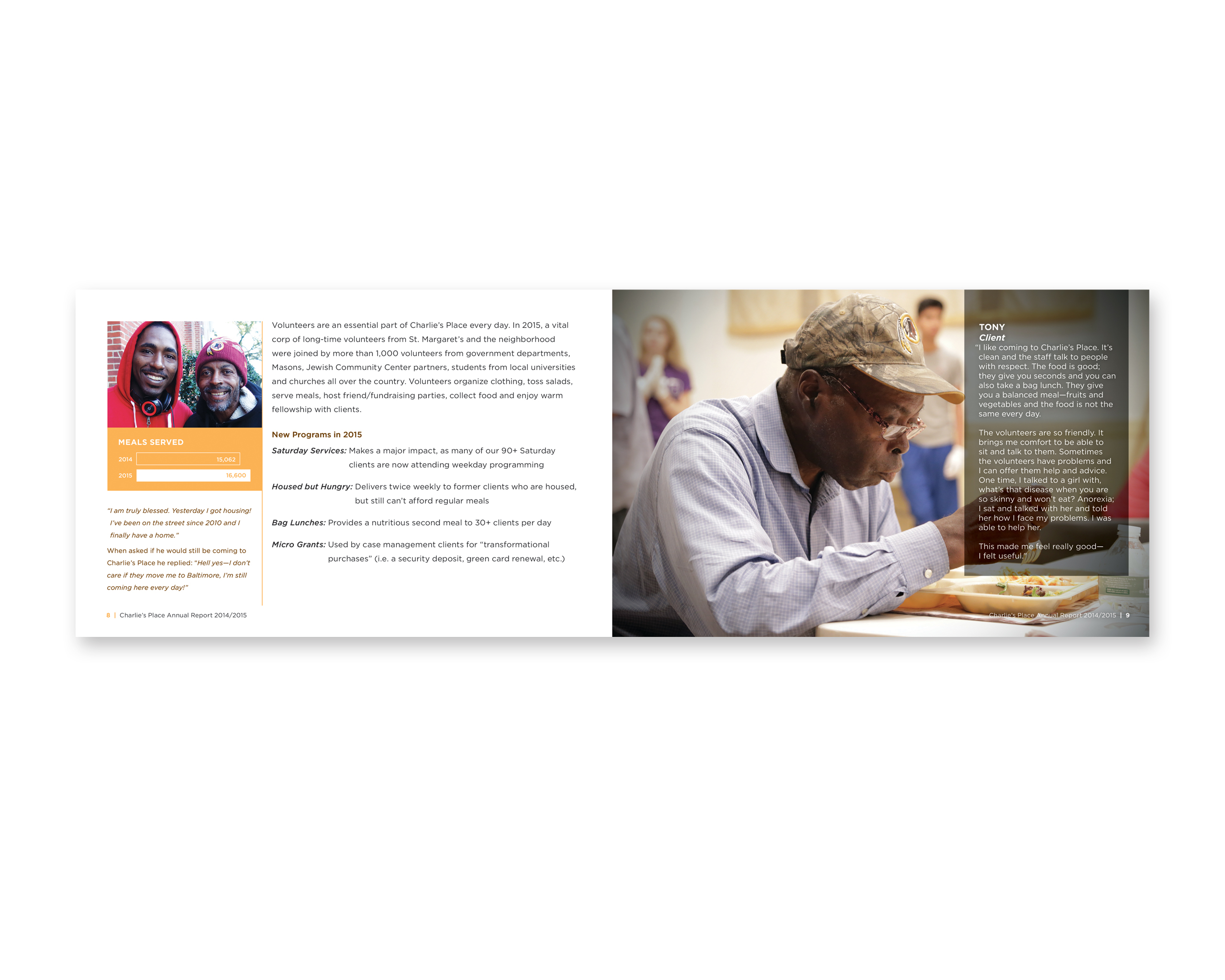
Charlie’s Place had done annual reports in the past, but this year they were looking for something which communicated not only their 25 years of dedicated service but also encouraged the residents of the extremely wealthy neighborhood which surrounds St. Margaret’s to financially support expanded services. These services include Saturday meals, food delivery twice a week to members who are housed but cannot afford food, bag lunches for a second meal a day, and micro grants for “transformational purposes” (i.e. a security deposit, green card renewal, etc). Similar to the logo, we wanted to convey the nonprofit’s warm sense of community. Using photographs we shot on site, full page images of clients and their favorite staff work with the branded color palette to support the report’s concept “At Charlie’s Place, I am not invisible. I have a name.” We edited all written content so that the verbal voice supported the visual, creating a consistent message. Finally, easy to decipher infographics made client, service and financial statistics penetrable to recipients.
In addition to design, I also provided interstitial language as well as onsite photography.